AI Misses Obvious UI Defects. A Calibrated Visual Diff Catches Them.
AI missed UI defects that were obvious to a human. A calibrated visual diff turned screenshot guessing into automatic, platform-aware feedback.
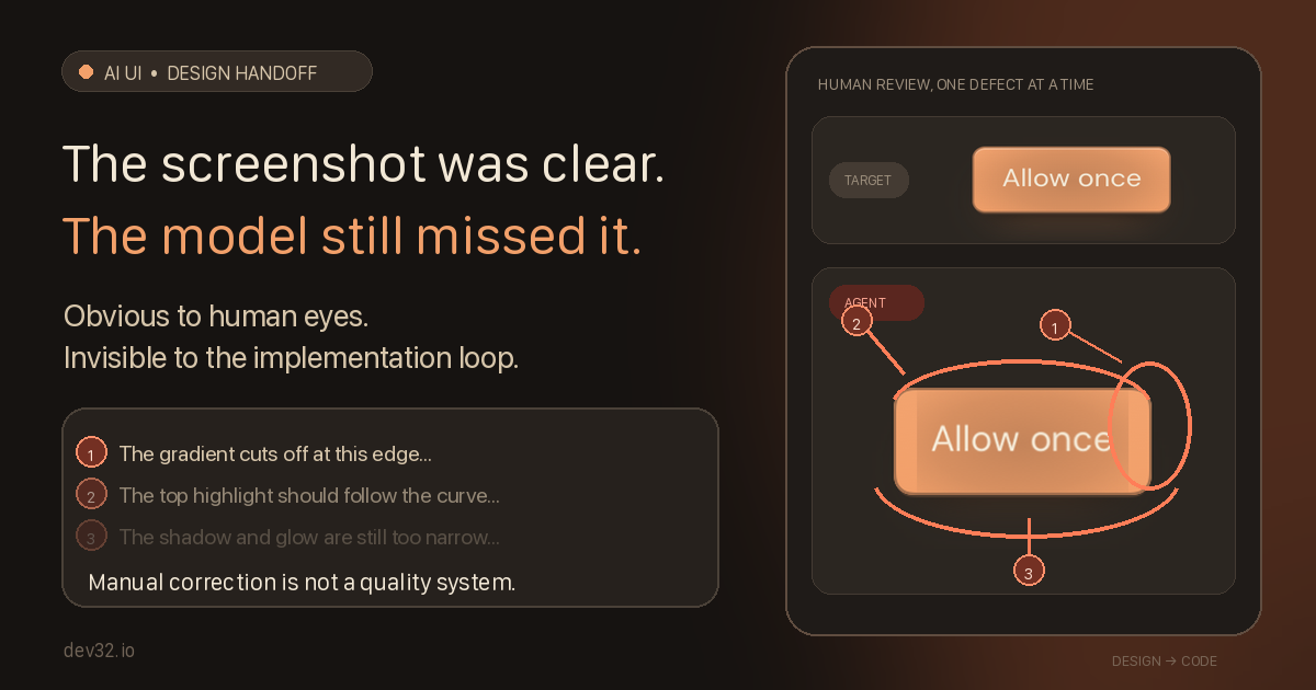
A screenshot shows an agent what to build. Visual feedback shows it what is still wrong.
We gave an implementation agent the approved mockup, its source, and a screenshot. The result was visibly wrong.
We could spot the bad lines, colors, shapes, glows, and shadows. The model could not. Even after it drove its own score down, the button still looked wrong.
In this experiment, more prompting did not solve the missing definition of done. A calibrated visual-diff loop did: capture the real component, compare it with the approved reference, and return the difference to the agent. But even a numeric pass could hide a defect that human review rejected.
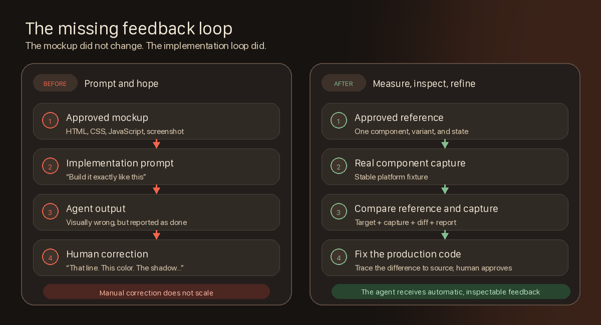
The handoff had no definition of done
The mockup was sound; the handoff was not. “Implement this exactly” gave the agent no measurable definition of done, so it produced code and judged its own output.
We needed the implementation itself to generate feedback.
The loop we added
The designer now produces one reference for each concrete UI case—for example, the primary button at rest. A small controlled test screen renders the real production component, not a visual substitute, and captures it at a fixed size and background.
Every iteration returns four things:
- the approved reference;
- the fresh production capture;
- a visual difference image;
- a compact machine-readable report.
The agent must inspect the images, trace meaningful differences back to the source styles, and repair the implementation. References are immutable, and the test screen cannot crop, shift, mask, or post-process a result into compliance.
That made visual feedback deterministic. It did not make it automatically trustworthy.
Our first metric rewarded the wrong work
An early iOS run spent about 102 minutes, made 156 source edits, and collected 416 visual measurements. Its reported mean difference improved from 5.59% to 0.64%.
The button still looked wrong.
The score was diluted by transparent canvas padding and ignored visible material differences. A zero-tolerance audit later found a 43.25% mean and 54.39% worst case. That audit was intentionally too sensitive, but it confirmed that the mismatch was not subtle.
The agent had optimized exactly what we measured. We had measured the wrong thing.
We corrected the denominator to count only pixels visible in either image, placed both captures on the product background, and separated two controls that had previously been confused:
- Pixel threshold: how different must a pair of pixels be before the detector marks it? Lower is more sensitive.
- Area gate: what percentage of the visible component may remain marked as different and still pass?
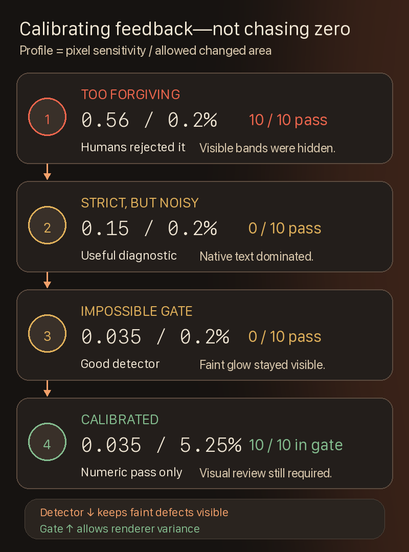
A profile such as 0.035 / 5.25% therefore means: detect faint pixel differences, but allow up to 5.25% of the visible component to differ before failing the numeric gate. Passing does not prove that every remaining difference is harmless.
Cross-platform rendering changed the answer
Browser engines and native iOS and Android renderers do not turn the same design into identical pixels. A universal “near zero” passing grade sounds rigorous, but can give an agent an impossible task.
Our iOS calibration moved through four stages:
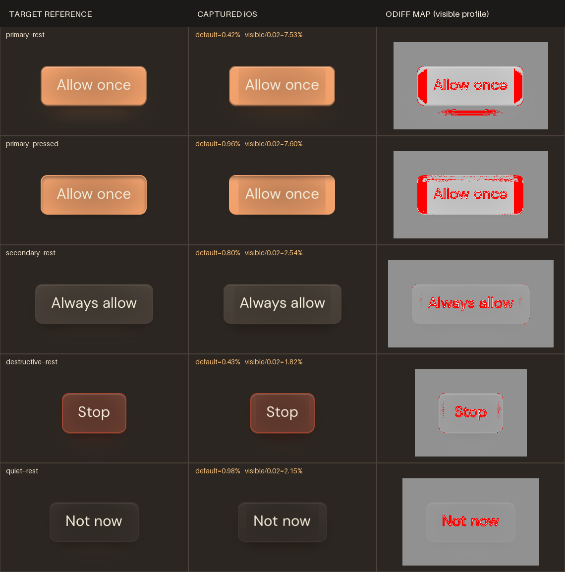
The numbers make more sense beside the images that produced them:
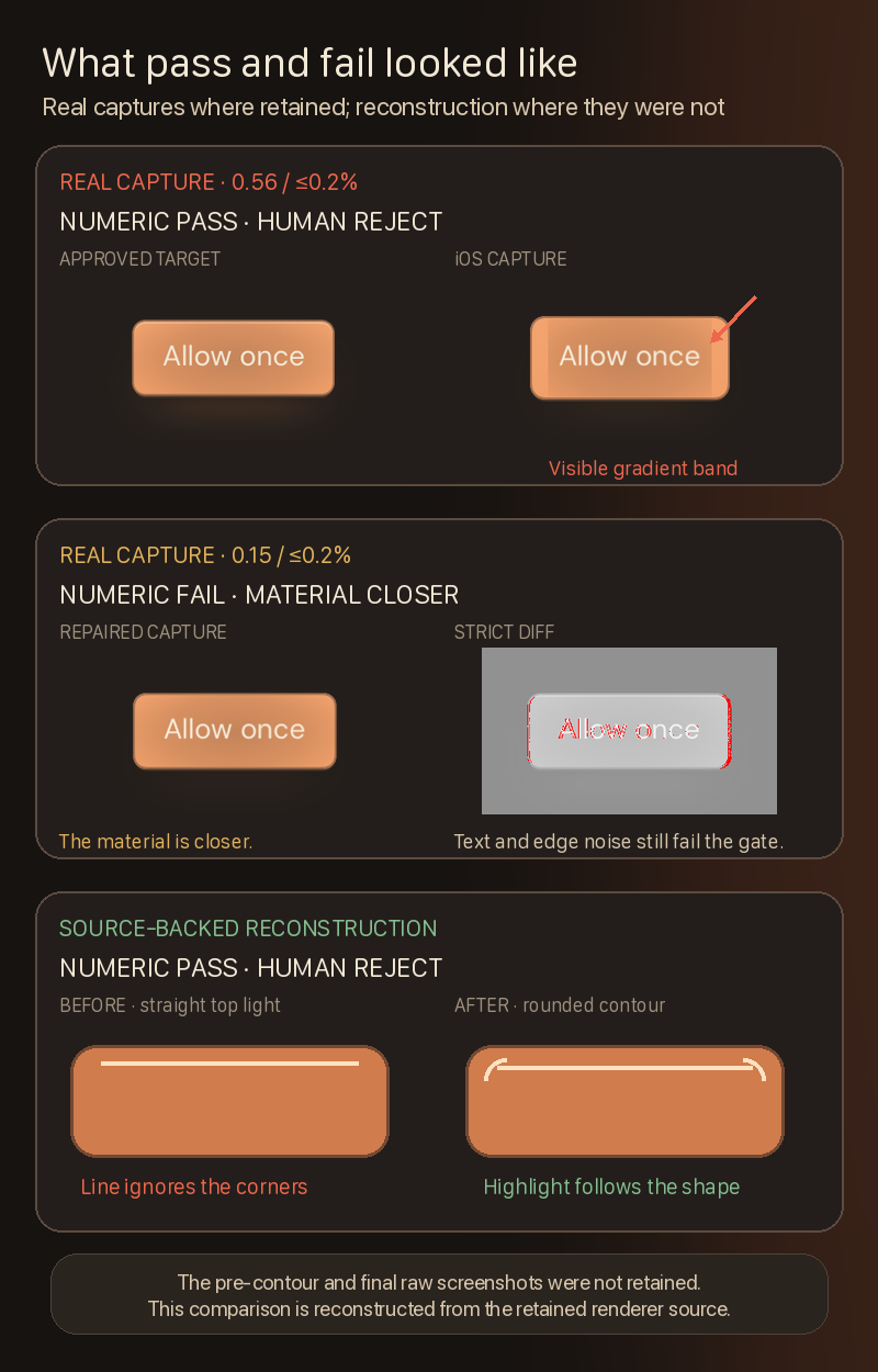
The first two rows use retained captures. The later pre-contour and final screenshots were not retained, so the bottom comparison is reconstructed from the renderer source rather than presented as raw evidence.
The final profile split sensitivity from tolerance:
- iOS needed a sensitive
0.035pixel threshold so faint glow, contour, and material defects remained visible. - It also needed a wider
5.25%area gate because the way iOS and the browser draw text already occupied several percent of the component.
Raising the pixel threshold hid meaningful defects. Keeping the area gate at 0.2% made the agent chase text differences the native renderer could never remove.
The later 0.035 / 5.25% measurements are session-derived. Their temporary raw comparator reports were not retained, so the archive preserves a curated calibration note rather than independent raw reports.
The detector and passing grade had to solve different problems.
A numeric pass still missed an obvious defect
The current profile was not enough by itself.
Before the final repair, all ten iOS button cases already passed numerically at 2.12–5.04%. Human review still found that the inner top highlight was a straight line instead of following the rounded button contour.
Text rasterization dominated the diff image, so the model classified the remaining report as “mostly text” and overlooked the smaller—but more meaningful—shape defect.
We changed the rule: inspect non-text differences before dismissing a passing score as text noise. Text rasterization could be ignored only after the shape, material, layout, and state matched.
The agent then traced the highlight back to the CSS inset shadow and replaced the straight-line approximation with a renderer that follows the rounded inner edge.
The numeric gate narrowed the search. The diff image and reviewer still had to decide whether the remaining red pixels were harmless text noise or a broken shape.
Results
| Outcome | Result |
|---|---|
| Web action-button states | 22/22 passed |
| Maximum Web changed area | 0.1% |
| iOS action-button states | 10/10 passed |
| Final iOS range | 1.92–5.09% |
| Visual-diff tool tests | 10/10 passed |
The iOS result retained native Button behavior, accessibility, pressed states, and a 44pt semantic target. Final review accepted the remaining text and one-pixel edge differences only after the gradient, glow, shine, rounded contour, layout, and states matched.
We were not asking SwiftUI text to reproduce browser pixels exactly. We needed feedback that kept design mistakes visible without forcing the agent to eliminate renderer noise.
Optional: implementation and evidence
Web captures use deterministic Playwright screens around real Preact components. iOS uses SnapshotTesting around real SwiftUI controls, and Android uses Compose screenshot infrastructure. References remain immutable; captures and diffs are disposable build artifacts.
The supporting repository archive retains the implementation details, historical reports, threshold sweeps, selected code, captures, commit provenance, checksums, and the provenance note for the session-derived iOS calibration.
The takeaway
A screenshot is a reference, not a feedback system. A calibrated visual diff helps an agent find meaningful defects while tolerating unavoidable renderer differences; human review catches the visible mistakes that a numeric gate can still miss.
Manual correction is not a quality system. Calibrated feedback is.